Lyric Videos: Packaging Music
The Rolling Stones, 1971, Sticky Fingers
Blondie, 1978, Picture This
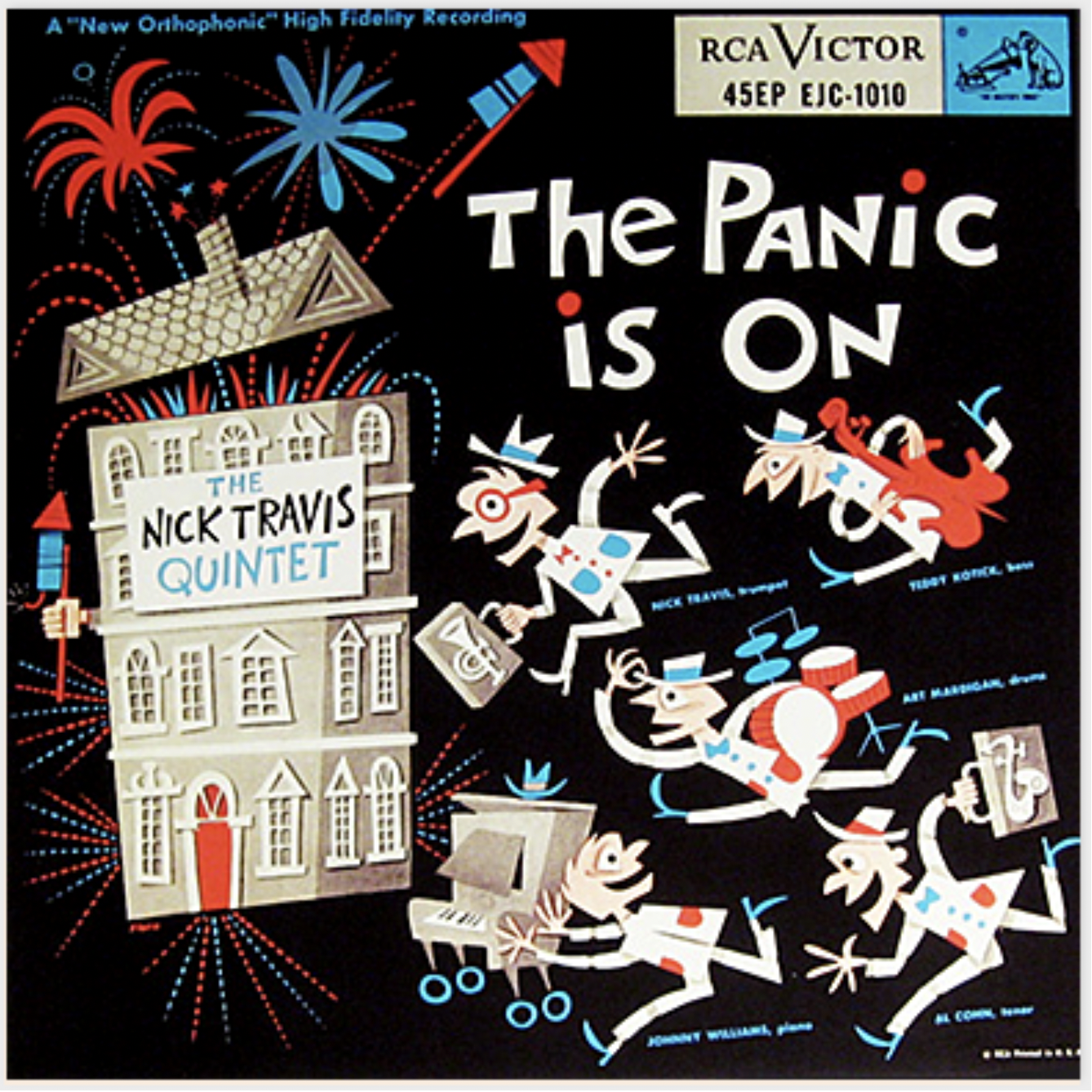
Nick Travis, 2000, The Panic Is On
What’s the first thing that comes to mind when you think of packaging? I’m not going to lie, my brain directly jets to food. But, since my brain is clearly biased, we’ll ignore it for the sake of this conversation. Today, we are talking music. How would you package music? How would you put a song in a box? How will you wrap it up in a beautiful sheet of paper and tie it with a bow? How would you pick a color for the bow and the paper? Since music is not technically a physical commodity, packaging it should be a challenge. This train of thought takes shape because most of us perceive packaging as a tangible concept, something we can touch, feel and open with our hands. And for a long time, the invention of things like record covers, cassette sheets and CD covers, kept this corporeal need satisfied. We bought them, adored them, opened them up, explored them and collected them. Problem solved. Or was it?
The presentation of music and lyrics has taken many forms over the years. Music often emerged from a social, religious or political context, came packaged with a story and always created an experience for it’s consumers.
To understand the concept of packaging music, we have to first understand everything that “music” embodies. Is it just words sung to a tune? Is it the harmonizing of an orchestra? Some of the more poetic among us may say they hear music in the sound of rain. Music is a subjective concept, it means different things to different people. To you and I, maybe it is the top 100 global charts on Apple Music, to my dog it will be the sound of her food in the microwave. What I am trying to say is, when you listen to a song, it comes with an experience and a feeling along with the technicalities and the noise. What makes a song great is how it makes you feel. How does packaging fit into that?
The presentation of music and lyrics has taken many forms over the years. Music often emerged from a social, religious or political context, came packaged with a story and always created an experience for it’s consumers. In the West, before the invention of the gramophone in the 1890s, experiencing music was a communal activity, in the form of choirs in churches, troubadours on the streets and dancing in the theatres. It came packaged as an event, however short or long.
Eventually, with the introduction of sound recording and playback technology, listening to music evolved from being a shared, social experience into a more personal and intimate one. One of the first compact musical experiences to gain widespread popularity were Records. Records gave songs a tactile quality, and the art on the covers served as a visual representation of the artist’s unique image and personality.
These vinyl record covers cultivated a large fan base, and today, exist as precious collectibles worth thousands of dollars. This trend then extended to songbooks and CD/cassette covers (that cleverly doubled as posters you could hang on your bedroom walls). These covers were typically sheets of glossy paper, with relevant photographs, art and lyrics printed on them, and album art became their digital manifestation.
The importance of cover design was so immense at the time, that it became a way for artists to popularize themselves and their work. Many renowned artists, such as Andy Warhol, Burt Goldblatt and Roger Dean either gained fame or kick-started their careers by designing album covers. (Alex Tokmakchiev, 2013)
The packaging of music took it’s first big leap into the “intangible” zone with a significant milestone: the introduction of Music Television (MTV).
The packaging of music took it’s first big leap into the “intangible” zone with significant milestones like the introduction of Music Television (MTV) and Karaoke. This is where things got interesting. MTV marked the onset of playlists, singles, albums and most importantly music videos, which gave fans an opportunity to delve deeper into the lives of their favorite artists, and feel closer to them. Meanwhile, Karaoke served as a more functional solution, for sing along, a modern take on the earlier group singing traditions. Though both completely different notions, they gave songs and their lyrics a new visual dimension, to establish meaningful interactions. Today, lyrical adaptations of songs use typography to both visually package the artist’s persona, as well as provide an insight into their thoughts, lives and choice of muses.
There are days when I am not such a fan of my job, but on other days (Like today!) I get to discuss Taylor Swift and her team’s solid branding and marketing skills that keep getting better and better with every passing album, and I remember why I do what I do. She is one of the top artists today, who packages her music into a vibe, gives it a personality and makes it feel tangible.
Let’s talk about Reputation, that came out in 2017.
She teased the album with the release of lyric videos of her songs. From where I’m standing, it feels like the lyric videos for this album make intelligent use of typography to recreate the edgy, controversial way in which she is portrayed in the tabloids and her consequent state of mind. We all know Tay Tay and her unfortunate run-ins with the media have caused her great turmoil in the past. Good on her to use that to make her work even more meaningful!
A literal representation of her inspiration can be noted in the album’s Blackletter cover art as well as her song, Gorgeous. The type forms and their arrangement used in this video, are a contemporary interpretation of the gothic visual language reminiscent of The New York Times, characterized by dark, bold and scandalous headlines and a classic serif for the body text. Visual hierarchy, by way of color and size, is used to lay emphasis on some words over others and backing vocals are communicated through the faded repetition of the same type forms. The same technique is also used in Call It What You Want To. This number, in keeping with the theme, plays in the form of a letter to her accusers, alternating between the passionate, handwritten and restrained typewriter fonts, symbolic of her two contradictory personalities.
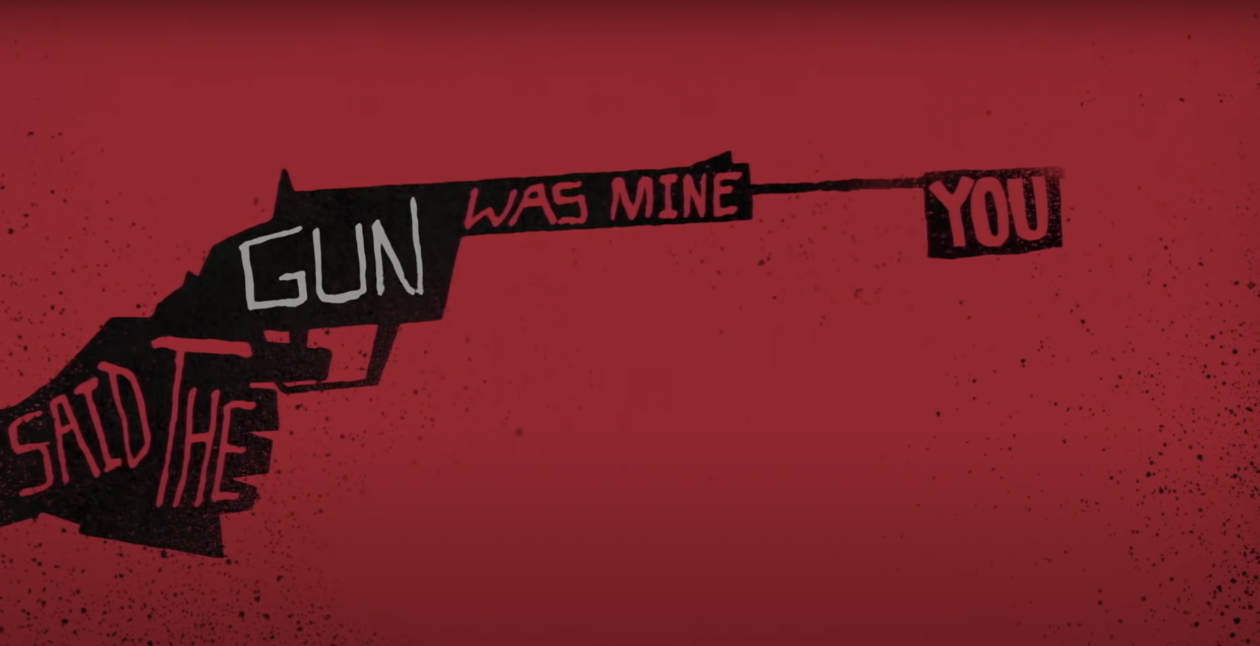
Look what you made me do, however, stands out because of it’s dark and color scheme, grungy illustrations and an overall Saul Bass-esque feel. This ultimate revenge song was the first to come out, breaking viewing records in it’s first 24 hours of limelight. The bold, all caps, crooked letter forms have a sinister quality; that when tempestuously put together, as in this video, bring out the eerie connotation of the lyrics beautifully. Together, the three seamlessly package the album, functioning as the perfect extension to the Taylor Swift brand.
Lyrical typography has recently emerged as a beautiful way of impalpably packaging an entire musical experience, to enjoy on your screens. And, I don’t know about you, but I’m ready for it. Teehee.
*This blog post is an extension of a paper I wrote and presented in 2018. If you’re interested in Lyrical Typography, you can find it here


